TightWind is written by Kyle Baxter. Stay Hungry. Stay Foolish.
They suggest that the slowdown in health inflation we have seen over the past decade is likely at an end, that Obamacare will not be bending the cost curve downward (as its champions promised it could), and that we are in dire need of health-care and entitlement reform that could better help contain costs. They also help us see just how daunting a challenge that really is.
The “Affordable Care Act” makes our health cost problem—already a disaster—worse, not better.
October 22nd, 2013My thanks to Tonx for sponsoring this week’s RSS feed. Tonx is special because not only is their coffee excellent, and not only do they ship new varietals each period, but you don’t have to worry about picking up more whenever you’re about to run out—it just shows up. Whether you’re just starting with coffee or already grind fresh coffee beans in your burr grinder each morning for your Chemex, Tonx is awesome.
Tonx is a small team of coffee experts who believe it’s easy to make a better cup in your kitchen than you’ll get at the best cafes – and for a fraction of the cost. By sourcing the finest coffees in the world and roasting them 24-hours before shipping, you’ll have the freshest coffee delivered straight to your door. And for a limited time, get a free trial to taste for yourself.
Also, Tonx is pleased to introduce The Frequency, an email newsletter packed with coffee secrets, brew tips, and special limited offers, exclusively for Tonx members.
October 22nd, 2013Ross Douthat on the Tea Party:
Yet at the same time, to the extent that policy differences are driving the current intra-G.O.P. fight, the populists tend to have 1) decent ideas and 2) a better sense than their establishment rivals of how to brand the party as something other than just a tool of rich people and business interests. Their strategy is disastrous, but their substance has something to recommend it. Which is part of the reason why it isn’t enough, for the Republicans to escape their current cul-de-sac, for the party leadership to “win” and the populist base to “lose” — let alone for the leadership to somehow jettison the base.
That’s the GOP’s conundrum: the Tea Party in the House is doing terrible things to the party, but there are the seeds for positive—even transformative—change of the GOP in the Tea Party with good leadership.
October 15th, 2013My thanks to Squarespace for sponsoring this week’s RSS feed. If you’ve been itching to start writing online, it’s a great way to do it.
What do you want people to see when they find you online?
Whether you’re growing a business, starting a blog, or are ready to sell online, you need to make a great impression. Squarespace is the best way to create a modern and professional website, with all the features you need integrated into one platform. Every Squarespace website is mobile-ready, includes e-commerce, and is backed up by award-winning 24/7 customer service.
Try Squarespace today at squarespace.com.
October 15th, 2013Nest Protect
October 8th, 2013Today, Nest announced their first new product since the Nest thermostat—Nest Protect. Nest Protect is a smoke and carbon monoxide alarm.
For an excellent look at Nest Protect, and profile of why they made it and the design process, you should read Stephen Levy’s piece for Wired.
…Wait, what? A smoke alarm?
Yes. Nest’s latest product is a $130 smoke alarm.
Nest’s basic strategy should be obvious now: take things we use in our daily lives but don’t at all enjoy using, or actively abhor using, and think through them so that they’re both better devices and delightful to own and use. (It’s also worth noting that they’re choosing product categories that are very large and universally needed.)
It’s more than that, though. The Nest thermostat and Nest Protect are standalone devices, but they work together. If you have a Nest thermostat and smoke alarms installed in your home, the smoke alarms will inform the thermostat when there’s movement in the home—which should make the Nest thermostat’s “Auto-Away” feature much more accurate, and thus able to be that much more efficient with a home’s energy use.
But what’s even more illuminating for what Nest’s vision is, though, is that if a Nest smoke alarm senses carbon monoxide, it will tell the thermostat to turn off the home’s furnace, which is a likely cause of carbon monoxide poisoning.
That’s truly smart. Nest has not only built two devices that work together to efficiently manage your home’s energy and protect you from fire, but they’ve created two devices that can actively judge the situation and work together to intervene in your home to keep you safe.
We’ve been hearing about the “smart home” for a very long time now, but this is the first time we’re legitimately there. Tony Fadell seemed to confirm this as Nest’s intent while talking with Stephen Levy:
In other words, Nest isn’t only about beautifying the thermostat or adding features to the lowly smoke detector. “We’re about creating the conscious home,” Fadell says. “To take a truly important device that has had no great innovation and make that device really, really great.” Left unsaid is a grander vision, with even bigger implications: many devices sensing the environment, talking to one another, and doing our bidding unprompted.
That’s a grand dream, and I think the Nest Protect—ostensibly just a smoke alarm—is going to be a key cog within their plan. Think about it: it’s not just a smoke alarm, but an Internet-connected computer with sophisticated sensors and software in every bedroom and on every floor. It knows when you wake up (since it has a motion-tracking sensor), when you go to bed, and even when you get up in the middle of the night. Along with the Nest thermostat, they also know when you leave for the day and when you get home. There’s a lot of immediate information there to begin doing some incredible things, and it’s something that could serve as a platform for all kinds of other services as well.
So yes, it is “just” a smoke alarm. And a very good one. But I think it’s also a piece of a much larger plan: make products that are so good that they can stand on their own and you’ll have to have them, but also work together to create something we’ve never seen before.
My thanks to MailChimp for sponsoring this week’s RSS feed.
The new generation of MailChimp adapts to your workflow, regardless of the device you’re using and size of your team. A cohesive experience across desktop and mobile devices means you can create, send, and track email campaigns in any context.
October 8th, 2013My thanks to Theme Foundry for sponsoring this week’s RSS feed.
The Theme Foundry has been building premium WordPress themes since 2008. They recently released Collections — a unique and beautiful WordPress theme for sharing, designed by Veerle Pieters. Visit the live demo of Collections to see it in action, or purchase it now for $79.
What makes The Theme Foundry special?
- A focus on quality over quantity. You won’t find a huge assortment on their site — they keep a small, curated collection of premium WordPress themes.
- Exclusive partner with WordPress.com (the official hosted WordPress provider). Each and every theme goes through a stringent audit process from some of the best WordPress coders in the world.
- Whole team support. You get fast and friendly support from the team that actually built your theme, not a part time support rep.
The 5C
September 24th, 2013In an excellent interview with Business Week, Tim Cook explained their thinking for the iPhone 5C:
We never had an objective to sell a low-cost phone. Our primary objective is to sell a great phone and provide a great experience, and we figured out a way to do it at a lower cost. Therefore, we can pass that on. And we figured out a way to sell 4S at substantially less than we were selling it for before, and we’re passing it on. So we think there will be a lot more people in our tent, and we can really serve a lot more people. And that feels good.
The iPhone 5C is fascinating to me because nearly everyone—including John Gruber—got it wrong: it isn’t a “cheap” iPhone. Rather, it’s something that’s both much more obvious and surprising.
Implicit in the idea that Apple should release a cheaper iPhone is that it would be a secondary model for people who want an affordable prepaid iPhone and for international markets; that is, an implicit assumption was that the iPhone/iPhone 5S would remain the mainstream iPhone. That isn’t what Apple is doing with the iPhone 5C.
Instead, Apple has taken the strategy they’ve followed since releasing the iPhone 4—take last year’s model and make it available at $99—and created a distinct product from it, and made it the mainstream iPhone.
Rather than move the iPhone down market with the iPhone 5C, Apple moved the “regular” iPhone—this year, the iPhone 5S—up market to become the pro version, and establish the iPhone 5C as the “regular” iPhone. The iPhone 5C is now the iPhone that really is good enough for everyone. The A6 processor is fast, so is LTE, and the iPhone 5′s camera is very, very good. The colors lend it a feeling of accessibility, too; it feels less serious than the iPhone 5′s aluminum design, more fun, and the colors allow for a greater feeling of personalization and whimsy. (The cases only amplify that, misplaced circles aside.) It’s a very good phone at a reasonable $99 price-point, and it’s going to look much better in the store to potential customers than last year’s iPhone model did.1
Apple’s marketing certainly seems to be trumpeting this, too. Apple’s home page features the iPhone 5C, not the 5S, and it’s playing heavily on the 5C’s colors. They featured an iPhone 5C ad, not one for the 5S. Tim Cook and Phil Schiller referred to the iPhone 5S as Apple’s most “forward-looking” iPhone yet. Apple is positioning the iPhone 5C as Apple’s iPhone for everyone, and the iPhone 5S for people who want the best.
That makes some sense on the face of it; it allows Apple to sell a “new” iPhone at $99 with 16GB of storage, but with lower cost of goods sold, which means they can maintain their margin. It may also allow Apple to push the envelope a bit more at the top end because they no longer need to manufacture enough iPhone 5Ss to satisfy nearly everyone purchasing a new iPhone at launch. But if the iPhone is under mortal threat from low-end, commodity Android-powered smartphones, then this decision seems bizarre. It won’t compete with those devices. The iPhone 5C is cheaper, but it’s not much cheaper.
But it starts to make a lot of sense if you think that smartphones aren’t so far along that the low-end, cheap models are good enough compared to the iPhone. If Apple can still provide superior hardware and software that, combined, make for a genuinely better device that is palpable for regular customers, then Apple has no need to bloody itself in the low-end washer machine.
And that’s exactly what Apple seems to think. Tim Cook explains what he thinks makes Apple so special, and what makes this strategy possible:
You look at innovation like the iPhone’s camera and the detail that went into the camera. Most people hear the word camera, and they think of hardware. And hardware is really important to it, you know? With the stuff we did with the flash on this. But it’s software, and it’s the silicon—I mean, it’s everything.
So the way I think about Apple is that the magic of this place really comes up at its best when hardware, software, and services come together. And it’s sort of the intersection of those things is where things get incredibly magical. So facilitating that to happen and getting the collaboration level for that to happen is the magic here.
And one of my proudest moments is when other people see that. They don’t know that they’re seeing that, and that’s also the beauty. They don’t have to do it. But look at these (gesturing to iPhones). These are perfect examples where the hardware and the software and the service begin to blend. In some ways you don’t tell one from the other.
The iPhone’s camera is the perfect example of what Cook is arguing. The iPhone’s camera—a cellphone camera!—is now so good that many people have nearly no need for a dedicated point-and-shoot camera. This is only true, though, because Apple has focused on developing the camera in a way that can’t be captured so well on a specification sheet but really does make for a better camera. Rather than boost their sensor’s megapixel count, Apple has kept it steady at 8 megapixels for three iPhone models, and instead has boosted the sensor’s size. They’ve focused on doing rather incredible things with the iPhone’s Image Signal Processor to make for, and choose, better photos. While these things don’t translate well to selling points for cell carrier sales associates, it does make for a truly better camera, and customers do notice the difference. As a result, the iPhone feels like a device in a class of its own.
The obvious choice was to make a more affordable iPhone. I don’t think Apple is religiously opposed to making a cheaper iPhone, but they will only do so if they can make a convincing product. What Cook is saying is that making truly good products comes first. Eventually, I believe, Apple will do exactly that. That shouldn’t be a surprise; the iPhone 5C is highly reminiscent of my first Apple product, and one of my favorite devices ever: the iPod Mini. The iPod Mini had less storage than even the third-generation iPod (10GB versus the Mini’s 4GB), and wasn’t that much cheaper than the third-generation iPod ($299 versus $249), either. Critics at the time were perplexed; if Apple was going to make a lower-end iPod to compete with more affordable competing devices, the iPod Mini certainly wasn’t it.
But it didn’t matter, because it was a damned good product. For me (as a high school student at the time), the lower price finally made it attainable, and the colors were fun in a way the regular iPod never was. The iPod Mini was incredibly successful, and it wasn’t the end; Apple replaced it with the iPod Nano in 2005 at lower prices, and introduced the iPod Shuffle—a completely different kind of music player—in 2005 as well at even lower prices.
I think the iPhone will follow precisely the same path. That is, I believe Apple will build some kind of “iPhone” product for the low-end eventually, but it may not look like an iPhone at all.2
In that sense, what Apple did was incredibly obvious: it’s what they’ve been doing since Steve Jobs returned to Apple. They don’t identify price-points and product attributes and then create a product to fill it, as most companies do. They create genuinely good, convincing products that solve real needs for people first.
If you’ve been concerned about where Apple is going under Tim Cook, this should be a sign that there’s nothing to be concerned about. Apple’s unrelenting focus on making truly great products is not only still there, but seems to be reinvigorated under Cook’s new management team.
There have been a lot of headlines lately with some variation of “Is Innovation Finished At Apple?” I believe the best may still be ahead of Apple.
My thanks to Igloo for sponsoring this week’s RSS feed.
Stop waiting for your IT department to move off SharePoint and start using an intranet you’ll actually like. Igloo is free to use with your team, it’s built around easy to use apps like blogging and file sharing, and it has social tools built right in to help you get work done.
It works on your desktop, your tablet and your phone. Inside or outside of your office. With your team or with your customers. Igloo is 100% white label, so you can make it look like your brand (with your developers or our in-house design and services team).
And if you’re in San Francisco, come learn how a social intranet can help your business succeed. Hear real world examples from our customers, technologists, and writers from Forbes and The Huffington Post. Our Social Intranet Tour hits San Francisco on October 15. We hope to see you there.
September 23rd, 2013This section from USA Today’s interview with Craig Federighi and Jonathan Ive highlights what makes Apple an exceptional company, and also their greatest weakness:
“This right here is what I love about Apple, this incredibly sophisticated powerful technology that you’re almost not aware of, it absolutely blows me away,” he says. “You can’t get this without working cross-functionally.”
Federighi is quick to admit that any engineer tasked with such a challenge would be sure to call attention to his brilliant work. “You know, you’re going to have some big message saying ‘Scanning!’ and buzz-buzz-zzz-zzz later it says ‘Authenticated,’ blink-blink-blink, with 10 seconds of animation,” he says, as Ive starts laughing.
“Ultimately we realized all that had to disappear,” says Federighi. “If it disappears, we know we’ve done it.”
That’s absolutely what is special about Apple, the focus on using technology in truly meaningful ways rather than to pad specification lists. But Apple’s talent for doing so with hardware and hardware and software hasn’t really extended into web services.
I’m not sure why that is. It could be that while Apple culturally believes in good design and integrating hardware and software, since those values have been with Apple since the very beginning, building terrific web services has never been something they’ve truly believed in as a company. I wonder, then, whether a part of Tim Cook’s management re-organization (which this USA Today piece seems to be meant to show the results of) is building that cultural focus and appreciation for web services.
September 19th, 2013Today, Apple released iOS 7—the most substantial update to iOS 7 since the App Store was introduced in 2008. With it, I am introducing a new version of Basil that is, yes, re-designed for iOS 7, but more importantly is a re-thinking of how key parts of the application work. I think it’s both simpler and more powerful. I’m very proud of it.
you can read more about it on the Basil weblog, or go and get it on the App Store.
I hope you all love it. It’s a privilege to work on an application so many people find useful.
September 18th, 2013My thanks to Booking.com for sponsoring this week’s RSS feed.
Forgive the cliche, but coming to work for Booking.com has been one of the best decisions. Within a week of arriving to the Netherlands, I had already created two UI experiments and pushed code to the live site. It was intimidating and thrilling at the same time. Those feelings haven’t left. I’m constantly humbled by the more than 300 super intelligent colleagues of 51+ nationalities! I learn every day. If there’s a day I don’t? It means I wasn’t in the office.
The warmth and acceptance of new hires is brilliant. I was invited for chess, football, drinks, and even knitting, within a fortnight. Friday after work drinks can easily evolve into an adventure anytime. There’s always something to do in this city. And at Booking.com, there’s always someone who’s willing to join in. The many parties are just something that has to be experienced. Come join and I’ll show you around!
September 18th, 2013Designing Basil’s New Timers
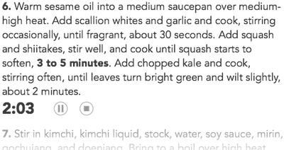
September 16th, 2013With iOS 7, I am releasing a large update to Basil. There’s a lot to talk about, and I’ll do so more this week, but I wanted to discuss the process around designing one of the main features: recipe timers.
When I released the first version of Basil, it would turn any time directions (the “15 minutes” in “Simmer for 15 minutes on low heat…”) into a button. When pressed, a timer would slide up on screen from the bottom. It was one of my favorite features because it made cooking a little easier in an immediately understandable way.
As soon as Basil hit the App Store, customers pointed out two large limitations. First, if you started a timer and switched to another application, it froze the timer. That’s not good, since switching to Safari to do things like look up how to properly slice a carrot into matchsticks or a substitute for masa is pretty typical in the kitchen. Second, Basil only allowed you to have a single timer running at a time, which made it difficult to time, say, two things cooking on the stove.
I’m happy to announce that the new version of Basil coming out this week addresses both of those limitations. But that’s not what I want to talk about.
Since I’ve been aware of these limitations since the just after Basil’s release, you may be wondering why I waited until now to address them. And you should be; it’s Basil’s biggest usability issue. You may especially be wondering why it’s taken so long since these limitations aren’t exactly a technically Hard Problem to solve.
It took this long because handling multiple timers turned out to be a fairly challenging design problem to solve while retaining Basil’s overall simplicity. Of course, I could have simply extended Basil’s current timer concept, and just show multiple timers across the bottom of the screen. It would look something like this:
That would have worked, but there are several serious problems with it. First, it magnifies an issue with the original design: the timers cover up a portion of the direction step at the bottom of the screen. Second, with multiple timer views across the bottom of the view, it’s also highly distracting. Third, it’s not at all clear which direction step each timer is associated with—which is a very bad thing when you’re cooking multiple things at once and forget which timer is for what.
So that concept wouldn’t work. The next route I briefly considered was using the same basic concept, but pushing the recipe view up, and putting the timers underneath it. That would solve the first problem, but not problems two and three, and it only solves the first problem by reducing the recipe’s screen space. That didn’t seem like a viable solution, either.
The third direction I considered was creating a timer “manager” of sorts that would only be visible when the user had opened a timer. If there were any open timers, Basil would show a little circle in the bottom-right of the view indicating how many active timers there were. Tapping it would open a view across the screen showing what timers were open for each recipe. It would be like a global look at all timers for your recipes, and you could pause or stop any of them, from anywhere in the application. It would look something like this (in sketch form, anyway):
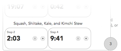
There are some advantages to this approach. It would solve problems one and two, since it would only be on screen when you want to glance at your timers. Also, it provides a lot of power: you can see where your timers are for your recipes from anywhere within Basil, so you can quickly check on the time for your beans on the stove while looking at your famous burger recipe to get them ready for the grill.
But as you can see from the illustration, it only adds that power by introducing enormous complexity. Now, you have a button/indicator view that appears in the screen’s right corner when you open a timer, and now you have a view that could literally show tens of timers at a time—which would mean that, for it to be useful, you would have to clear any timers you open but don’t end up wanting to use. And even when you manage it correctly, it’s still confusingly complex. There’s a lot going on in one view to comprehend when you’re trying to cook.
I dismissed that design path because it would effectively destroy the timer feature’s purpose by introducing complexity. If it’s too much to deal with, you won’t use it, and that’s especially true when it’s for an application that won’t be your sole focus most of the time. Implementing the timer manager would technically solve the original timer implementation’s limitations, and technically make it much more powerful, but substantively it would make the feature completely useless. And worse, it would water down Basil’s core focus: making things simple so you can focus on cooking.
Realizing how wrong the timer manager design is was frustrating. I’d spent a lot of time and brain power heading down that path, and it was completely wrong. What it forced me to do, though, is think about the feature’s purpose again with a fresh mind. Instead of thinking about how to make Basil’s timer feature—something that’s bolted on top of the recipe view—more powerful, I thought about how I could make it simpler.
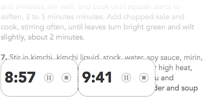
In Basil’s original design, I thought of the timers like a digital equivalent to an actual timer—something separate from the recipe itself that would slide on and off screen as needed. But then I thought that distinction didn’t make sense; a timer is conceptually tied to the direction step it comes from. If step two says to sauté onions for five minutes, that timer for five minutes should be tied to step two. So why not just put the timer in the direction step itself? Like this:
While this doesn’t achieve the same power as the recipe manager, it not only solves problems one and two, but it also solves problem three by directly tying the timer to its direction step. There’s no question what a timer is tied to when you glance at it, and there’s no extra text to read to indicate it, either.
By doing so, this design path both simplifies the recipe view visually, which is highly desirable for cooking, and naturally presents multiple timers. I’m extremely proud that it makes a more powerful feature possible by simplifying the design concept. Hopefully, if I’ve done my job, none of this will ever occur to the user. It should seem obvious, and they should never have to think about it.
I wanted to step through some of the design process and my thinking for this feature because often when we use applications, how an interface is conceptually designed seems obvious, and implementing new features seems like it should be incredibly easy. Designing interfaces, though, is never easy, and while much of it may seem obvious, the details that only become apparent once you’ve thought through every part of it are the ones that cause a design to fail.
September 11th, 2013My idea here is not so much of convenience (which is nice) but rather of usability. I know many folks with vision-and motor-related issues who bemoan iOS’s passcode prompt because not only does it take time, but also entering in said code isn’t necessarily an easy task. In fact, more than a few lament this so often that they forego a passcode altogether because it’s time-consuming and a pain (sometimes literally) to enter.
From Shawn Blanc’s thoughts on Tuesday’s iPhone event:
Alas, Apple still has issues with off-device photo storage, syncing, etc. It’d be great if Apple took that same energy for innovation they are putting on the iPhone’s camera (hardware and software side) and devote it to vastly improving photo storage and organization with iCloud and multiple devices.
This is easily my biggest pain-point in day-to-day use with my iPhone.
September 11th, 2013
-
Welcome.

Welcome to TightWind. If you liked what you read above, you can read more in the archives and subscribe to the new ones. If you'd like to introduce yourself, you can send me an email or a message on Twitter.