TightWind is written by Kyle Baxter. Stay Hungry. Stay Foolish.
Designing Basil’s New Timers
September 16th, 2013With iOS 7, I am releasing a large update to Basil. There’s a lot to talk about, and I’ll do so more this week, but I wanted to discuss the process around designing one of the main features: recipe timers.
When I released the first version of Basil, it would turn any time directions (the “15 minutes” in “Simmer for 15 minutes on low heat…”) into a button. When pressed, a timer would slide up on screen from the bottom. It was one of my favorite features because it made cooking a little easier in an immediately understandable way.
As soon as Basil hit the App Store, customers pointed out two large limitations. First, if you started a timer and switched to another application, it froze the timer. That’s not good, since switching to Safari to do things like look up how to properly slice a carrot into matchsticks or a substitute for masa is pretty typical in the kitchen. Second, Basil only allowed you to have a single timer running at a time, which made it difficult to time, say, two things cooking on the stove.
I’m happy to announce that the new version of Basil coming out this week addresses both of those limitations. But that’s not what I want to talk about.
Since I’ve been aware of these limitations since the just after Basil’s release, you may be wondering why I waited until now to address them. And you should be; it’s Basil’s biggest usability issue. You may especially be wondering why it’s taken so long since these limitations aren’t exactly a technically Hard Problem to solve.
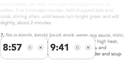
It took this long because handling multiple timers turned out to be a fairly challenging design problem to solve while retaining Basil’s overall simplicity. Of course, I could have simply extended Basil’s current timer concept, and just show multiple timers across the bottom of the screen. It would look something like this:

That would have worked, but there are several serious problems with it. First, it magnifies an issue with the original design: the timers cover up a portion of the direction step at the bottom of the screen. Second, with multiple timer views across the bottom of the view, it’s also highly distracting. Third, it’s not at all clear which direction step each timer is associated with—which is a very bad thing when you’re cooking multiple things at once and forget which timer is for what.
So that concept wouldn’t work. The next route I briefly considered was using the same basic concept, but pushing the recipe view up, and putting the timers underneath it. That would solve the first problem, but not problems two and three, and it only solves the first problem by reducing the recipe’s screen space. That didn’t seem like a viable solution, either.
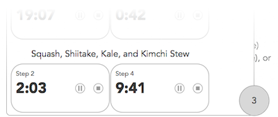
The third direction I considered was creating a timer “manager” of sorts that would only be visible when the user had opened a timer. If there were any open timers, Basil would show a little circle in the bottom-right of the view indicating how many active timers there were. Tapping it would open a view across the screen showing what timers were open for each recipe. It would be like a global look at all timers for your recipes, and you could pause or stop any of them, from anywhere in the application. It would look something like this (in sketch form, anyway):

There are some advantages to this approach. It would solve problems one and two, since it would only be on screen when you want to glance at your timers. Also, it provides a lot of power: you can see where your timers are for your recipes from anywhere within Basil, so you can quickly check on the time for your beans on the stove while looking at your famous burger recipe to get them ready for the grill.
But as you can see from the illustration, it only adds that power by introducing enormous complexity. Now, you have a button/indicator view that appears in the screen’s right corner when you open a timer, and now you have a view that could literally show tens of timers at a time—which would mean that, for it to be useful, you would have to clear any timers you open but don’t end up wanting to use. And even when you manage it correctly, it’s still confusingly complex. There’s a lot going on in one view to comprehend when you’re trying to cook.
I dismissed that design path because it would effectively destroy the timer feature’s purpose by introducing complexity. If it’s too much to deal with, you won’t use it, and that’s especially true when it’s for an application that won’t be your sole focus most of the time. Implementing the timer manager would technically solve the original timer implementation’s limitations, and technically make it much more powerful, but substantively it would make the feature completely useless. And worse, it would water down Basil’s core focus: making things simple so you can focus on cooking.
Realizing how wrong the timer manager design is was frustrating. I’d spent a lot of time and brain power heading down that path, and it was completely wrong. What it forced me to do, though, is think about the feature’s purpose again with a fresh mind. Instead of thinking about how to make Basil’s timer feature—something that’s bolted on top of the recipe view—more powerful, I thought about how I could make it simpler.
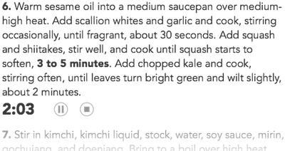
In Basil’s original design, I thought of the timers like a digital equivalent to an actual timer—something separate from the recipe itself that would slide on and off screen as needed. But then I thought that distinction didn’t make sense; a timer is conceptually tied to the direction step it comes from. If step two says to sauté onions for five minutes, that timer for five minutes should be tied to step two. So why not just put the timer in the direction step itself? Like this:

While this doesn’t achieve the same power as the recipe manager, it not only solves problems one and two, but it also solves problem three by directly tying the timer to its direction step. There’s no question what a timer is tied to when you glance at it, and there’s no extra text to read to indicate it, either.
By doing so, this design path both simplifies the recipe view visually, which is highly desirable for cooking, and naturally presents multiple timers. I’m extremely proud that it makes a more powerful feature possible by simplifying the design concept. Hopefully, if I’ve done my job, none of this will ever occur to the user. It should seem obvious, and they should never have to think about it.
I wanted to step through some of the design process and my thinking for this feature because often when we use applications, how an interface is conceptually designed seems obvious, and implementing new features seems like it should be incredibly easy. Designing interfaces, though, is never easy, and while much of it may seem obvious, the details that only become apparent once you’ve thought through every part of it are the ones that cause a design to fail.

