TightWind is written by Kyle Baxter. Stay Hungry. Stay Foolish.
Things in Review
August 6th, 2008Junior year of high school (2004-2005), I realized that committing my tasks to memory was not a viable strategy, but up until that year, that was more or less how I managed doing work. I was facing a memory-storage deficit; between my course load, and debate, which was a work-intensive activity, I simply could not remember everything I had to do. Due to sheer number of tasks, I sometimes turned in incomplete assignments or, worse, forgot to turn anything in at all. My productivity diminished under the strain of remembering what I had to do, and my stress skyrocketed because of what seemed like an insurmountable amount of work and obligations.
My English teacher had a Ti Powerbook, which he used every day in class. This was my first real experience with post-OS X era Macs, and I loved its elegant design. But what struck me, in brief flashes as he switched between applications on the projector screen, was iCal. He had several calendars set up, and his month view was full of events — all colorfully differentiated. iCal, from what I saw, was easy to conceptualize and use, and most importantly, was a joy to work in. It looked like it was fun to add events to and manage a calendar.
I bought my first Mac in December 2005 (a 15″ Powerbook), and iCal was the first application I fell in love with. It made — and still makes — managing my schedule simple and enjoyable.
But when I entered college, I had a problem: I needed less to manage events (turning in papers, taking tests, study sessions, et cetera), and more to manage tasks associated with courses (research for a paper, write an outline, study for a test), which iCal is not very good at. I tried using iCal’s to-dos support for three weeks, and after painstakingly entering hundreds of to-dos, I stopped using it — because I did not enjoy it.
So for my first and second years of college, I suffered much the same way I did in high school: I mostly committed tasks to memory, with even more disastrous results. My stress rose to a new high as I struggled to keep my tasks straight for five courses and work.
What I really wanted was a well-designed, simple and beautiful application to manage my tasks, which would make managing tasks as much a joy to use as iCal.
After reading Chris Bowler’s excellent GTD Series, I decided to try Cultured Code’s Things.
Conceptual
When I downloaded Things, I had certain requirements in mind, which amounted to three points:
- I must be able to easily enter tasks — there should be very little resistance to entering tasks, unlike iCal.
- It must be well-designed, and simple. A long feature list is not a positive thing.
- I must really love using it.
It is a short list of requirements, but they are not easy to meet.
A productivity application is only as useful as how much users actually use it. A to-do application is utterly useless if users do not use it all of the time — if a user spreads their tasks out across a to-do application and, say, a notebook, they have two places they must reference when working on that project, which wastes time. Ultimately, then, they are likely to stop using the application altogether because it creates little value for them.
Storing tasks in memory and on paper is the default way people tend to manage their tasks. Using a computer-based application, then, is a change, something new — and therefore the first thing to be thrown out if it is not absolutely stunning.
That is why I judge Things — and any productivity application — by these criteria. Unless it is absolutely great, I will lapse in using it, and eventually will not use it at all. If it feels like more work, rather than making my work easier, then I will delete it.
First Use
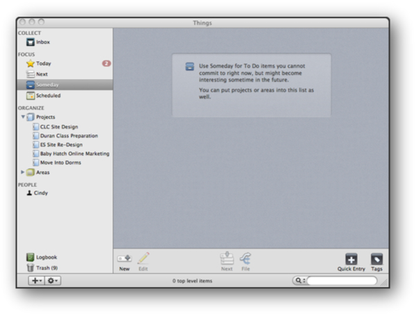
When a user first opens an application, especially one like Things which is complementary rather than necessary for doing work, the application’s intention, and how to use it, should be immediately obvious. Users should not have to search through the help menu to begin using it.
When first launching Things, it is clear how to use it. Things uses a source list along the left side, like many Mac OS X applications, and it makes excellent use of it. It is uncluttered and well-labeled, which helps make Things intuitive.
What I love most, however, is what Things does in empty views. When you move between the different views, such as Inbox, Today, and Projects, rather than simply displaying an empty gray window where tasks go, Things has a simple box with a description of how this view is used.
It is a lovely way of helping users grok the application. An empty screen discourages the user, right when they need the most encouragement. This description box is also an excellent use of otherwise wasted space. Even better, though, is these descriptions are well-written. They are simple and straightforward.
Things also uses large, clear icons along the bottom for interacting with tasks. The “New” button’s icon, which creates new tasks, projects, or areas depending on the view, is particularly good. It is a simple addition symbol overlaid on a task item. Its simplicity is quite inviting — after reading the short view descriptions, the first thing I did was click the New button and add a task, which is what a new user should be encouraged by the application’s design to do.
Source List
Things has four different kinds of views in the source list: Collect, Focus, Organize, and People. These break down further into different views.
Collect holds only one kind of view — the Inbox, which is where new tasks are first deposited, much like in Mail.
Organize breaks down into the user’s different Projects and Areas, which they create. “Projects” and “Areas” are contexts for tasks. For example, I am currently re-designing my employer’s website, which is a project — it has a defined beginning and end, so I have a “Site Re-Design” Project in Things, which contains all relevant tasks, such as completing mockups and collecting stock imagery.
An “Area” is an equally-simple concept. An Area is an ongoing area of responsibility a user has. So, for example, running TightWind is an Area in Things, which contains any general day-to-day tasks I must complete for the site.
Projects and Areas are excellent concepts for organizing tasks, because at their most basic level, this is how we tend to organize tasks within our minds. As a result, there is no learning curve for using Projects and Areas, which helps new users quickly adopt the applications and create their own system.
Projects has a very subtle, but powerful, feature. When viewing a list of projects, the left side of each project, which shows how many tasks it has, displays a progress bar in its background. As more tasks are completed, a darker shade of blue fills in:
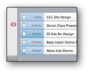
This allows the user to see at a glance how much progress they have made on all of their projects.
A similar touch is when viewing tasks that are due today, Things changes its header, checkbox and days until due box to a red color:
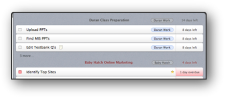
These two features, in their subtlety and utility, reflect an attention-to-detail not usually seen in a 2.0, let alone a not even 1.0, release.
Things’s source list is well thought out, which is seen in its simplicity. Interacting with tasks, as a result, is quick. Unfortunately, however, the source list is not perfect. Dragging to re-sort Projects and Areas is not yet supported,1 and worse, it does not support right-clicking or global commands like CMD-D, the intuitive way to delete items in the source list. The only way to delete Projects or Areas is to click on an action button in the bottom-left of the application, which is not immediately obvious. In discussion, Michael Mistretta noted that it took him almost half an hour to realize how to delete a Project or Area.
The source list should support both commands and right-clicking to delete or rename items, and I am sure it will gain this ability in future updates.
Getting Things Out
Clicking the New button open this form:
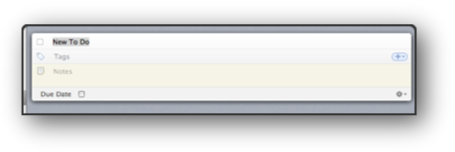
This task form is wonderful. It is simple — each line has one data-type with a subtle color differentiation. Its simplicity keeps the user’s focus on their task, rather than the application.
This seems rather insignificant to value so much; after all, it is only a task form, and because it is so simple, overlooking its utility is tempting. But in a productivity application, there is little more important than the task form. Users will only enter their tasks if it is easy to do so. Things, luckily, makes it quite simple; there is no excess content in the form, and it can be controlled entirely with the keyboard. My only complaint, however, is the due date. It is a checkbox, which indicates that it must be clicked to be used, even though it can be checked with the space bar. I would prefer that rather than have a check box in the due date section, it has a grayed out date — e.g. “08/06/08″ — which would indicate that the user can add a date by tabbing through.
Usually, though, new tasks are discovered while in other applications, such as while viewing an email in Mail.app, in an instant messaging conversation, using the web, or on the phone. Switching away from your current application to Things and entering a new task can be prohibitively disruptive to your workflow, and annoying.
Luckily, though, Things contains a quick-add overlay, which can be invoked whether Things has focus or not:
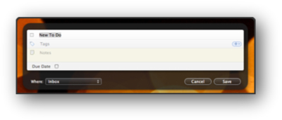
The quick-add overlay allows users to add tasks no matter what application they are in, without disturbing their workflow. It floats above the currently open application but does not shift application focus; once the user clicks Save, everything is exactly as it was before — except now the Inbox has a new task. This feature is what makes Things useful. It allows users to quickly add tasks as they come to mind, without any superfluous thought and effort.
This makes it simple to quickly enter a batch of new tasks after receiving a new project or a meeting, which is when I least want to do any more work.
Aesthetics
Things is stunning, but for different reasons than usual. It is stunning because of its minimalism, not flash. Things uses subdued blues, grays and reds, which shift focus away from the application and on to the tasks themselves. This is consistent with Things’s philosophy: to make task management both easy and fun. Things is not cluttered with extraneous features, graphics, animations or colors. It stays out of the user’s way.
It also feels very much like a Leopard application. Its colors and source list means that Things blends right into Leopard, and it feels right when used next to iTunes, Mail.app, NetNewsWire, and other well-designed OS X applications. This consistency helps the user focus on their tasks rather than the application’s peculiarities. Less wasted time figuring out the application means more productivity.
My one complaint is its dock icon. Things is an application that I want permanently in the dock, but I only want well-designed and beautiful icons in it. Icons like Coda’s. Things’s dock icon is an inbox filled to the brim, with a check mark on top.2 It is bland, and at smaller sizes, the inbox is not very clear — meaning it does not succeed at even being immediately identifiable. The dock icon’s mediocrity is odd considering Things’s well thought-out design and small touches. Hopefully the 1.0 release brings a new icon design.
Satisfaction
After finishing a difficult or consuming task, I am proud — proud that I have finished it, and usually, proud of the work I have done. That satisfaction is a reward for completing something and doing it well, a pride of success, and an encouragement to continue.
Unfortunately, I do not attain that same satisfaction when checking off a task in Things. After hours of work, of proud work, I check off the task and — the task turns dark gray. Anti-climactic. It is like watching Lord of the Rings: The Fellowship of the Ring for three hours with bated excitement to see its conclusion, only to find it does not really end at all. They just cut it. Except worse, with Things, there are no sequels to satisfy your thirst for an ending.
Checking off a task in an application will never be as satisfying as actually completing the task, but it must do something. Without some sort of reward in the application, I tend to lapse in checking off tasks, and soon I will not even bother opening Things because it is so behind. Ultimately, satisfaction from checking off a task does not result from the application, but the application should also give the user an Ahhh feeling. The kind of feeling where you lean back in your chair and take a sip of something cold and tasty, because you have finished something.
The experience has to be end to end — from when the user enters a new task, to when they finish it. Satisfying from beginning to end. It does not need to be much — it can be something as simple as after checking the task, it fades to a light gray and shrinks slightly in size. Still simple, still not distracting, yet also effective in encouraging further use.
There is an added benefit here, too. Making completed tasks a light gray, as opposed to the dark gray they currently use, better differentiates between completed and uncompleted tasks. Light gray is a common color for indicating something is finished or no longer relevant, but it does not distract from unfinished tasks. Of course, they could have taken another route, which is color finished tasks green, but this coloration would pull the user’s eye to finished tasks, rather than where it should be — on the unfinished ones. I am glad Cultured Code decided to use different shades of gray to differentiate between unfinished and finished tasks, but it needs some slight tweaking.
Review
I add new tasks to Things mostly through its quick-add overlay after receiving new things to do in other applications or on the phone. I do not bother changing their location, so at the end of each day I make a pass through the inbox and add tags and notes, and then I file them.
I love the quick-add overlay because it forces me to overlook detail in the first entry. I try to get everything out of my head as quickly as possible, which means that the tasks are incomplete and may contain errors. This forces me to make that pass-through, to review my tasks. How important is this? Do I really need to work on this now? What approach am I going to take to finish this? Is it the best approach? After a second look, my answers to these questions can change significantly, so this process is invaluable.
This also helps remove the burden of memory, and stress. Using memory as a to-do list, besides being a poor technique, also creates a huge responsibility. I may not remember a detail correctly or may even forget a task altogether, and that constant second-guessing — what if I am wrong? — ruins confidence and, ultimately, makes me even less productive. By inputting my new tasks as quickly as I can, and reviewing them afterward, I eliminate that nagging doubt.
A daily review has another benefit when compared to memory, too. Recalling tasks, especially a long list of them, is challenging, and tends to make the tasks seem even more difficult than they are. By reviewing them daily, however, I see them for what they really are, rather than with the added challenge of recollection.
Chris Bowler also recommends a weekly review (hence his weblog’s name), where you evaluate how successful you have been and where you can improve. I love this idea, and Things tends to make it an enjoyable experience, but there are two troublesome issues. Things allows the user to change the order of a Project’s tasks by dragging it to its proper place, unless its proper place is first in the list. Things does not allow you, as far as I can tell, to move a task to the top of a list. Rather, you must move it to second in the list, and then move the current first task below it. I am not sure if this is by design, but it is rather annoying.
UPDATE: Chris emailed me and showed that this is indeed possible to do. Thanks for the correction, Chris.
The second issue is viewing notes. When a task has a note attached to it, a little note icon appears on the task. But the only way to view that task’s notes is to double-click the task, which makes it editable. It is a clunky experience, and should not be necessary. It feels like opening an article in Word to read it, which is painful. Rather, when you click on the notes icon, it should pop up. Clicking it again, or anywhere else, would dismiss it.
It is important to remember that Things is not even a 1.0 release yet, and with that in mind, it is quite incredible. It is well designed, beautiful, and polished. Things feels much more like a finished application than one still in development, but it is — and that means great things for the future.
It certainly is not perfect. The source list does not support drag and drop nor commands, the dock icon is uninspired, the new task form is slightly imperfect, tasks cannot be fully re-ordered, and task notes are not easily viewable.
But these imperfections are just that: things that are slightly wrong but can — and I am confident, will — be fixed quickly. They are small marks on a wonderfully-conceptualized and designed, beautiful application that is a joy to use. What I love most about Things is its level of detail, the small touches, which show just how much effort Cultured Code invested in every stage of its development. They truly want to create something great, and I think they have.
The true test of an application is not how long its feature list is, or how slick it is, but whether users enjoy using it. And I am one user who does.
