TightWind is written by Kyle Baxter. Stay Hungry. Stay Foolish.
Designing a Tablet Newspaper Application
December 14th, 2009Apple’s apparently impending tablet has grabbed me, for one reason: I love to read. Reading the newspaper over breakfast is a kind of meditation for me, a slow morning routine that prepares me for the rest of the day.
After that ritual, which I look forward to every morning, I go and read through my feeds on my computer, and the differences between the two are jarring. One is relaxed, considered and focused; the other frantic.
So I am interested in the tablet not because it will be a new toy to play with, but because it could be a suitable replacement for print — with all the advantages of a web-connected device — that a computer will never be.
I am interested in it, because I can see myself sitting down with a tablet in the morning, next to my bowl of cereal and tea, and reading the newspaper and a select few feeds for an hour.
But video and other multimedia content isn’t particularly appealing to me, like Time Inc.’s mockup. An excellent reading experience, just as engrossing as print, is.
I’ve done two mockups of what I would like to see for a newspaper. The first is the “first page”:
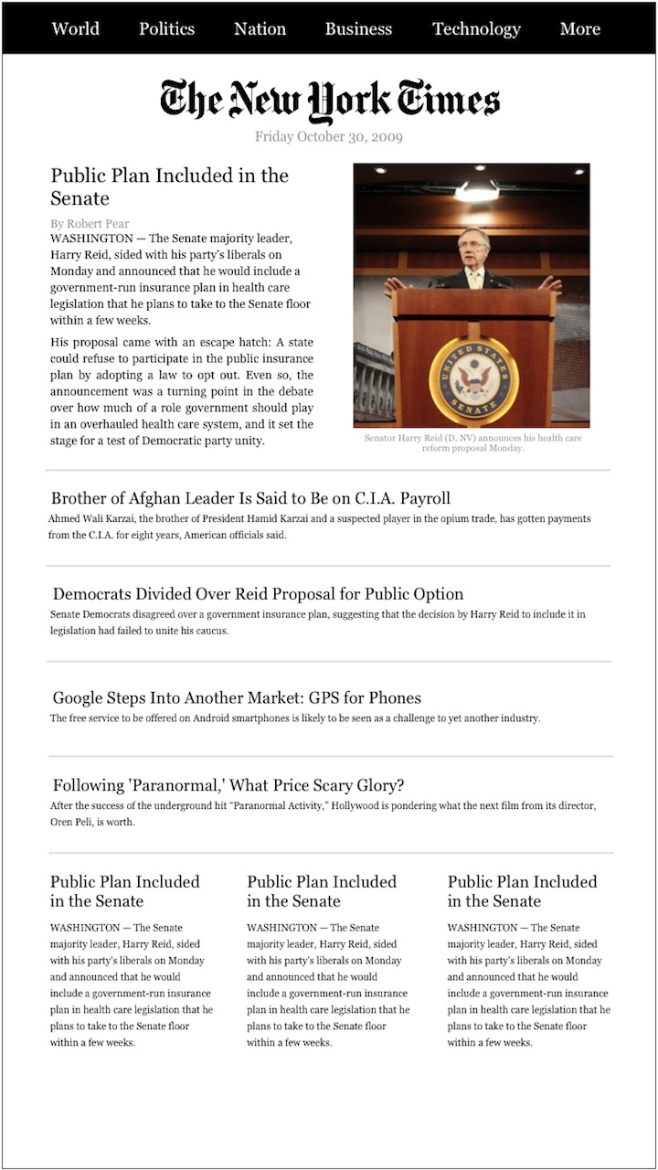
(Click to enlarge and reveal the rest of the page)
Rather than adopt the typical newspaper layout to the tablet screen, which would likely require zooming in on each article to read it, each article is perfectly readable without zooming. The central advantage of a newspaper’s first page is the large number of articles that it has, and thus the breadth of content it shows. I kept that feature, but did so in a way that is readable without zooming.
A newspaper works in a simple way — you either flip through it to get to the section you want, or pull that section out and read it first. I want the application to be just as simple for jumping to a new section, so you can move to one easily from anywhere in the application. Rather than make a navigation screen, it has a permanent bar at the top which gives you immediate access to any section.
When you want to read one of the articles, you just tap on it, and it opens it in the article view:
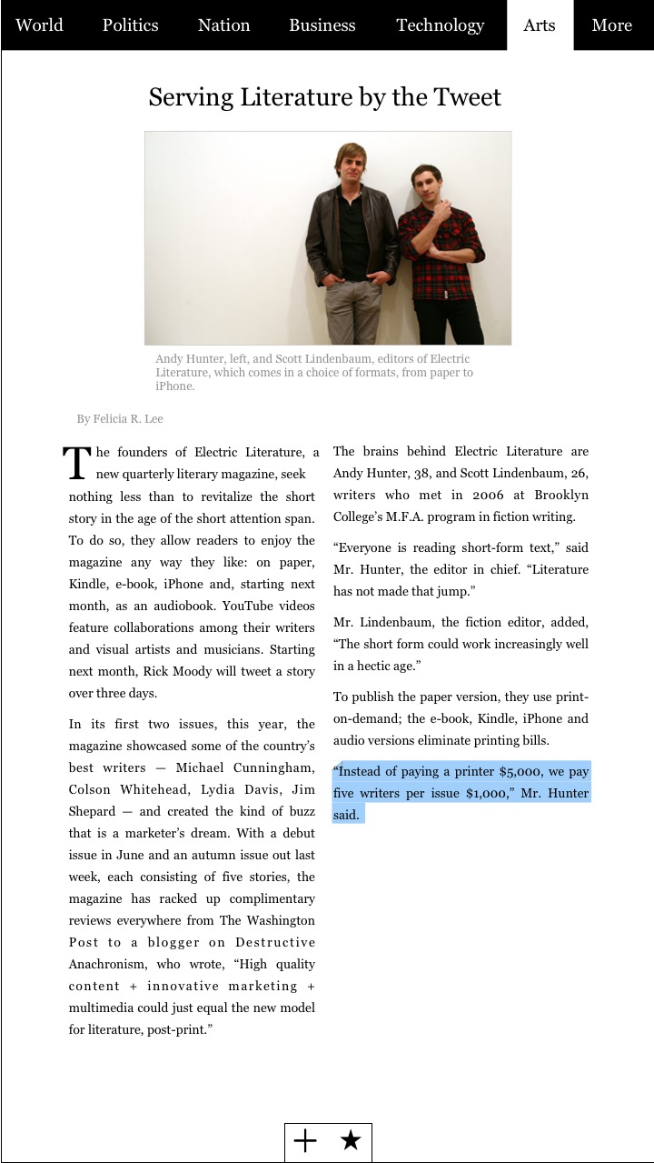
The article view has the same bar at the top, so you can jump to any section.
There is little UI, or any other visual distractions — just the text and relevant image. To change pages, you slide your finger from the right edge toward the left edge, just like other ebook applications on the iPhone.
While reading, I like to highlight and take notes for articles I might use in later work. To do this, you tap and hold with two fingers on the text, and then run your finger along the text to highlight it. You can add a note as well, which is then attached to the highlighted portion (this is signified by the dog-eared edge of the highlighted text).
As I discussed in an earlier article on the tablet, I want these noted sections to be compiled for you and synced back to your Mac with the citation, so it is ready to be inserted into whatever you are writing.
The UI elements at the bottom do what you expect — the plus button, when pressed, allows you to share it via Twitter or email, while the star allows you to save it for later. I wasn’t (and am still not) sure what the best way to do these things is. I want as little UI clutter on the screen as possible, so I initially wanted the UI elements only to pop up when you tapped on the screen (like several iPhone applications do), but this is too clunky. They pop up when you accidentally tap the screen, and end up being a distraction.
I also thought about using gestures, but I couldn’t think of a gesture that is conceptually associated with sharing, and would be discoverable by users. I then thought about a little tab at the bottom, which you could pull up to reveal the UI elements. I rejected this because it introduces complexity and more steps into something that should be dead simple.
Instead, I tried to make them as unobtrusive as possible. Rather than look like a bar overlaid on the screen, I wanted them to look more like they are a part of the page, just as the text is. As a result, the reader shouldn’t think about them at all — they are not covering any part of the page, but are on the page itself, and so they shouldn’t be a factor until they need to use them.

-
Welcome.

Welcome to TightWind. If you liked what you read above, you can read more in the archives and subscribe to the new ones. If you'd like to introduce yourself, you can send me an email or a message on Twitter.